MaskComm
This project was completed over the duration of an internship at Endoluminal Sciences, a medical startup company. It was a corporate social repsonsibity project in response to the Covid-19 pandemic in partnership with NSW Health.
Facemasks come in a variety of types and shapes, each having its own benefits in specific contexts. Disposable facemasks are made form cloth, with elastic strings attached to help secure them to the face. While these are the most commonly found, their application becomes limited in environments such as surgical theatres, which in the context of Covid-19, require higher levels of protection for both surgeons/doctors and patients. The answer to this are respirator masks, which create a full seal around the mouth and nose.

3M 7500 Series Mask:
The microphone unit was made to fit the 3M 7500 Series respirator mask.
These respirator masks utilise removable filters to increase protection against small airborne particles. However, due to the seal, these masks hinder the ability to communicate clearly. The focus of this project was to develop a system that could amplify the voice, without compromising the protective qualities of the mask.
The company developed a microphone unit, a silicone unit, that sits within the mask and connects to a wearable speaker. My role within this project was to develop the brand identity, this being the Logo, Box Packaging Design, Box insert Packaging, Instructions for Use Manual, Basic Website Design, and Product Production.

Initial Logo Development

Logo Development with Colour Options
The logo colours were selected by the head of the company, with multiple design options offered. The chosen design path for the logo was to incorporate the letters of MaskComm as the body of the logo. Design inspiration was to keep the logo clean, minimal, and similar to that of technology companies. Medical company logos and tech companies such as audio brands (Bose, Senheiser, Bang and Olufsen, etc.) were analysed for their lettering and style. The development of the logo required constant consultation to ensure that the logo was developed to the stylistic choice of the client.
The finalised logo was created out of 3 equal sized squares, with their shapes altered using equal sized circles. The body of the logo is made up of the same square that has been repeated and orientated in different positions. The shape was then further rounded to create a cleaner shape.
The finalised logo was created out of 3 equal sized squares, with their shapes altered using equal sized circles. The body of the logo is made up of the same square that has been repeated and orientated in different positions. The shape was then further rounded to create a cleaner shape.

Logo Shape Development

Final Logo Design
The box was being created to a custom size, and required a custom design. The inspiration given was the design and colours of Apple's product boxes. The layout and style was recreated with a unique interpretation, specific to the product. The final front sticker was a dark grey, to the preference of the client. These stickers were applied to the product box.

Front Box Sticker

Back Box Sticker

Final Front Box Sticker
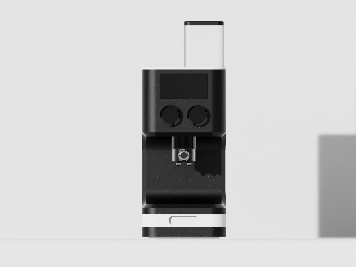
The Instructions for Use manual required product renders to be made to allow for the rendering of different perspectives of the object. These were modelled in SolidWorks and rendered in KeyShot.


Website Design was done through an online website building service, Wix. It required product renders and context imagery, in the form of photography. This was to portray the product in an attractive manner and to communicate the situation in which the product may be used.